The Financial KPI Dashboard Excel Template for Accountants offers a comprehensive tool for tracking key financial performance indicators efficiently. This Excel template enables accountants to visualize metrics such as cash flow, profitability, and expense ratios in real-time, enhancing decision-making processes. Customizable charts and automated calculations streamline financial analysis, making it an essential resource for accurate reporting and strategic planning.
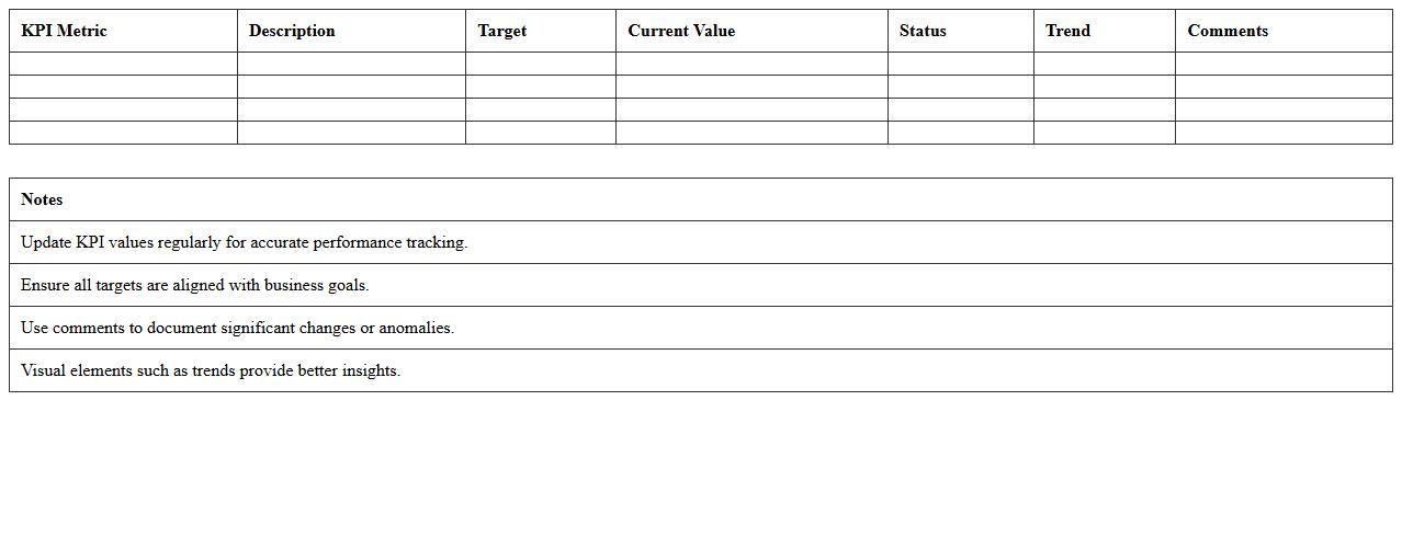
Revenue Performance KPI Excel Dashboard Template
The
Revenue Performance KPI Excel Dashboard Template is a dynamic tool designed to track and visualize key revenue metrics, enabling businesses to monitor sales growth, profit margins, and customer acquisition costs effectively. It consolidates financial data into easy-to-read charts and graphs, empowering managers to make data-driven decisions and identify trends or issues quickly. This template enhances operational efficiency by providing real-time insights that support strategic planning and revenue optimization.
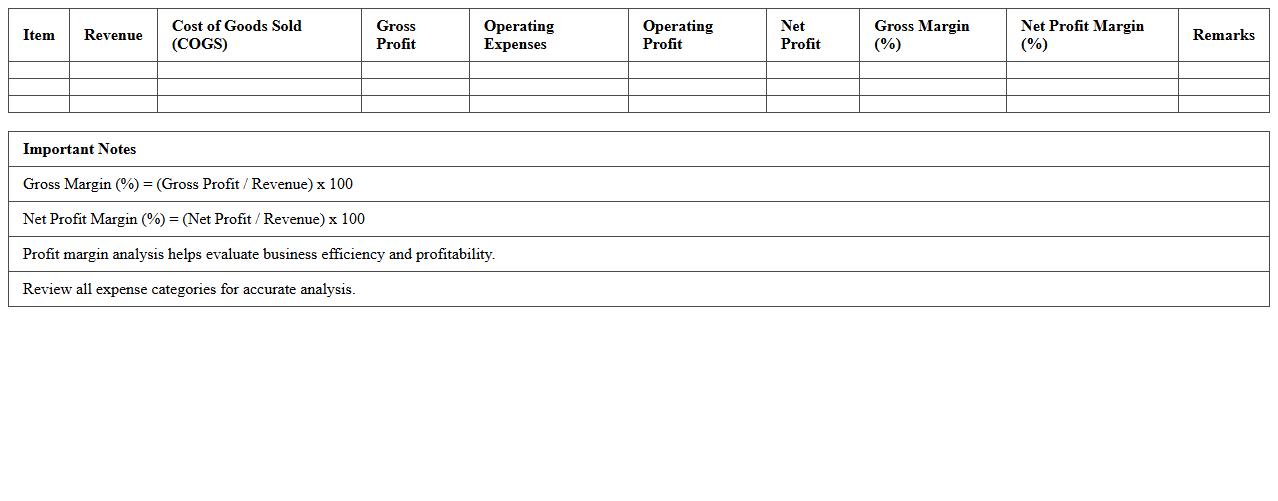
Profit Margin Analysis Excel KPI Template
The
Profit Margin Analysis Excel KPI Template document is a powerful tool designed to calculate, track, and visualize profit margins across various business segments. It enables users to identify trends, measure operational efficiency, and make data-driven decisions by providing clear insights into gross, operating, and net profit margins. This template streamlines financial analysis, helping businesses optimize pricing strategies and improve overall profitability.
Expense Tracking Financial KPI Spreadsheet
An
Expense Tracking Financial KPI Spreadsheet document is a tool designed to monitor and analyze business expenses by categorizing costs and calculating key performance indicators (KPIs) such as cost variance, expense ratio, and budget adherence. It helps organizations maintain financial discipline by providing real-time insights into spending patterns, enhancing budget management, and identifying opportunities for cost reduction. This spreadsheet supports data-driven decision-making by enabling clear visualization of financial metrics essential for improving overall profitability and operational efficiency.
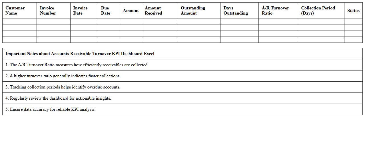
Accounts Receivable Turnover KPI Dashboard Excel
The
Accounts Receivable Turnover KPI Dashboard Excel document tracks the efficiency of a company's credit and collection efforts by measuring how quickly receivables are collected. It consolidates key financial data into an easy-to-read format, highlighting turnover ratios, aging reports, and payment trends to identify outstanding debts. This dashboard enables businesses to optimize cash flow management, reduce bad debt risk, and improve overall financial health through actionable insights.
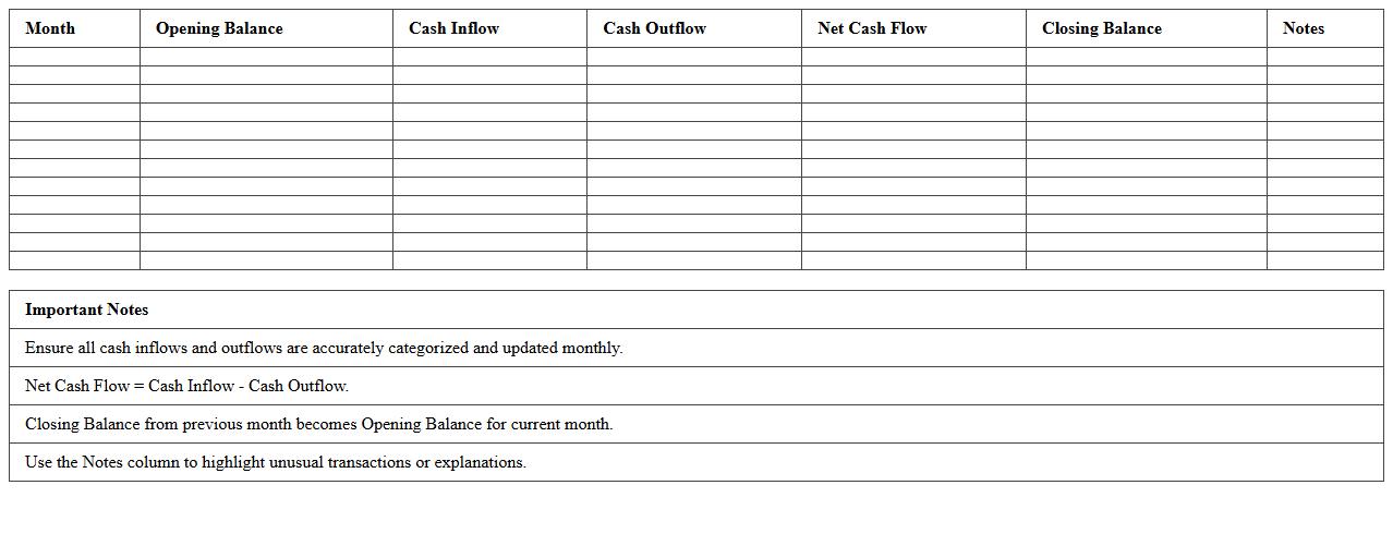
Monthly Cash Flow KPI Excel Template
The
Monthly Cash Flow KPI Excel Template document is a powerful financial tool designed to track and analyze cash inflows and outflows on a monthly basis, enabling businesses to maintain liquidity and plan effectively. It provides clear visualization of key performance indicators such as net cash flow, operating cash flow, and cash reserves, helping users identify trends and make informed budgeting decisions. By automating calculations and offering customizable metrics, this template streamlines cash management and supports strategic financial planning to ensure sustainable business growth.
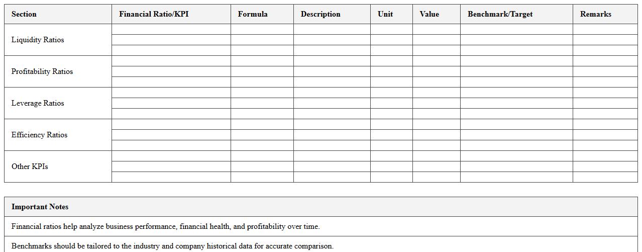
Financial Ratio Analysis KPI Excel Sheet
Financial Ratio Analysis KPI Excel Sheet is a powerful tool designed to calculate and visualize key financial metrics such as liquidity ratios, profitability ratios, and solvency ratios, enabling businesses to assess their financial health effectively. This document allows users to
track performance indicators systematically, compare financial data over various periods, and make informed decisions based on accurate and organized financial insights. By consolidating complex data into an easy-to-use format, it enhances financial reporting accuracy and supports strategic planning for improved business outcomes.
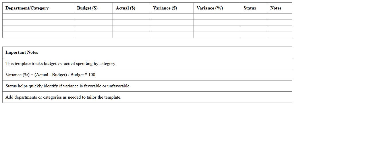
Budget Variance Financial KPI Excel Template
The
Budget Variance Financial KPI Excel Template document is a tool designed to track and analyze the differences between budgeted and actual financial performance. It helps businesses identify areas where spending deviates from planned budgets, enabling more accurate financial forecasting and improved cost control. By providing clear visualizations and metrics, this template supports informed decision-making and enhances overall financial management efficiency.
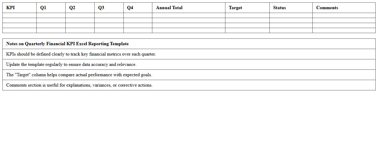
Quarterly Financial KPI Excel Reporting Template
The
Quarterly Financial KPI Excel Reporting Template is a structured spreadsheet designed to track and analyze key financial performance indicators every quarter. It enables businesses to monitor revenue, expenses, profit margins, and cash flow trends efficiently, providing clear insights for strategic decision-making. This template enhances financial transparency and accountability by consolidating essential metrics in an easy-to-understand format, facilitating timely and informed business assessments.
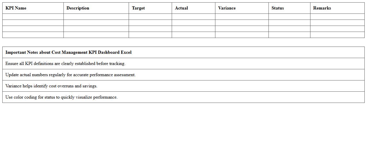
Cost Management KPI Dashboard Excel
A
Cost Management KPI Dashboard Excel document is a powerful tool designed to track, analyze, and visualize key performance indicators related to project or organizational expenses. It helps identify cost overruns, monitor budget adherence, and optimize resource allocation by providing real-time insights into spending patterns. Utilizing this dashboard improves financial decision-making, enhances accountability, and drives cost efficiency across business operations.
Net Income Analysis KPI Excel Template
The
Net Income Analysis KPI Excel Template document is a powerful tool designed to track and evaluate a company's profitability by analyzing net income metrics over time. It enables businesses to visualize financial performance, pinpoint trends, and make data-driven decisions to improve operational efficiency and profitability. Utilizing this template streamlines financial reporting processes and enhances strategic planning through clear, organized, and customizable data representations.
What formulas best automate ROI tracking in a financial KPI dashboard Excel template for accountants?
To automate ROI tracking in Excel, use the formula: (Net Profit / Cost of Investment) * 100, which calculates the percentage return efficiently. Incorporate dynamic named ranges or Excel Tables to ensure the formula updates automatically with new data. Additionally, combining the ROI formula with Excel's IFERROR function can prevent errors from disrupting dashboard analytics.
How do you design conditional formatting to flag cash flow issues in a financial KPI dashboard?
Use conditional formatting in Excel to highlight negative cash flow or values below a set threshold, making issues visible at a glance. Apply rules such as "Cell Value Less Than 0" or custom formulas to change cell colors to red or orange for urgent attention. This visual alert system enhances proactive financial monitoring and improves dashboard functionality.
Which Excel pivot tables are optimal for segmenting KPI metrics by client or department?
Pivot tables with client or department fields in the Rows or Columns area allow clear segmentation of KPI metrics for detailed analysis. Adding calculated fields helps track aggregated financial performance measures across groups. Filtering and slicers further optimize pivot tables, providing dynamic views tailored to audience needs.
How can accountants integrate live bank feeds for real-time KPI updates in Excel?
Accountants can integrate live bank feeds using Excel's Power Query to connect to bank APIs or CSV files that auto-refresh with new transactions. This setup enables direct import of financial data, ensuring KPI metrics are updated in near real-time. Additionally, leveraging Excel's data model supports seamless data integration without manual entry.
What are the top chart types to visualize EBITDA trends in an accountant's KPI dashboard?
Line charts are ideal for showing EBITDA trends over time, highlighting growth patterns and fluctuations clearly. Column or bar charts effectively compare EBITDA across different periods or business units, making comparative analysis straightforward. Combining these with sparklines or area charts can enhance dashboard interactivity and insight.
More Dashboard Excel Templates