The Waterfall Chart Excel Template for Financial Forecasting visually breaks down financial data to highlight positive and negative values, making it easier to track profit changes over time. This template is ideal for analyzing revenue streams, expenses, and net income in a clear, sequential format. Users can customize the chart to suit various financial scenarios, enabling more accurate budget planning and decision-making.
Waterfall Chart Excel Template for Revenue Forecasting
The
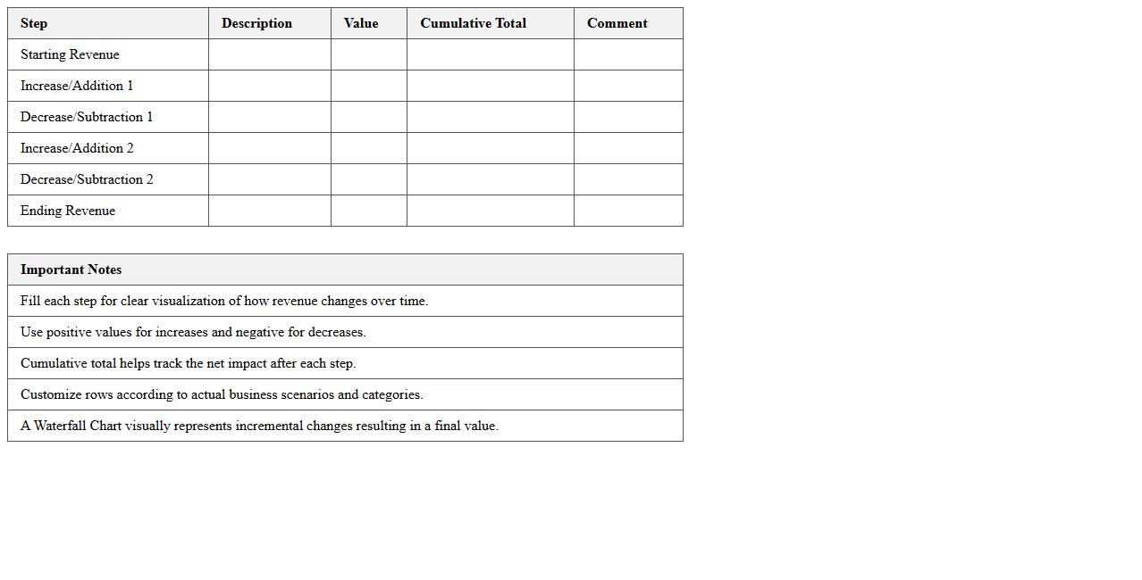
Waterfall Chart Excel Template for Revenue Forecasting is a visual tool designed to track changes in revenue over time by highlighting positive and negative values sequentially. It simplifies the analysis of financial data, allowing users to identify key drivers of revenue growth or decline and make informed budgeting decisions. This template enhances clarity in forecasting, making it easier to communicate financial trends to stakeholders.
Waterfall Chart Excel Template for Expense Analysis
A
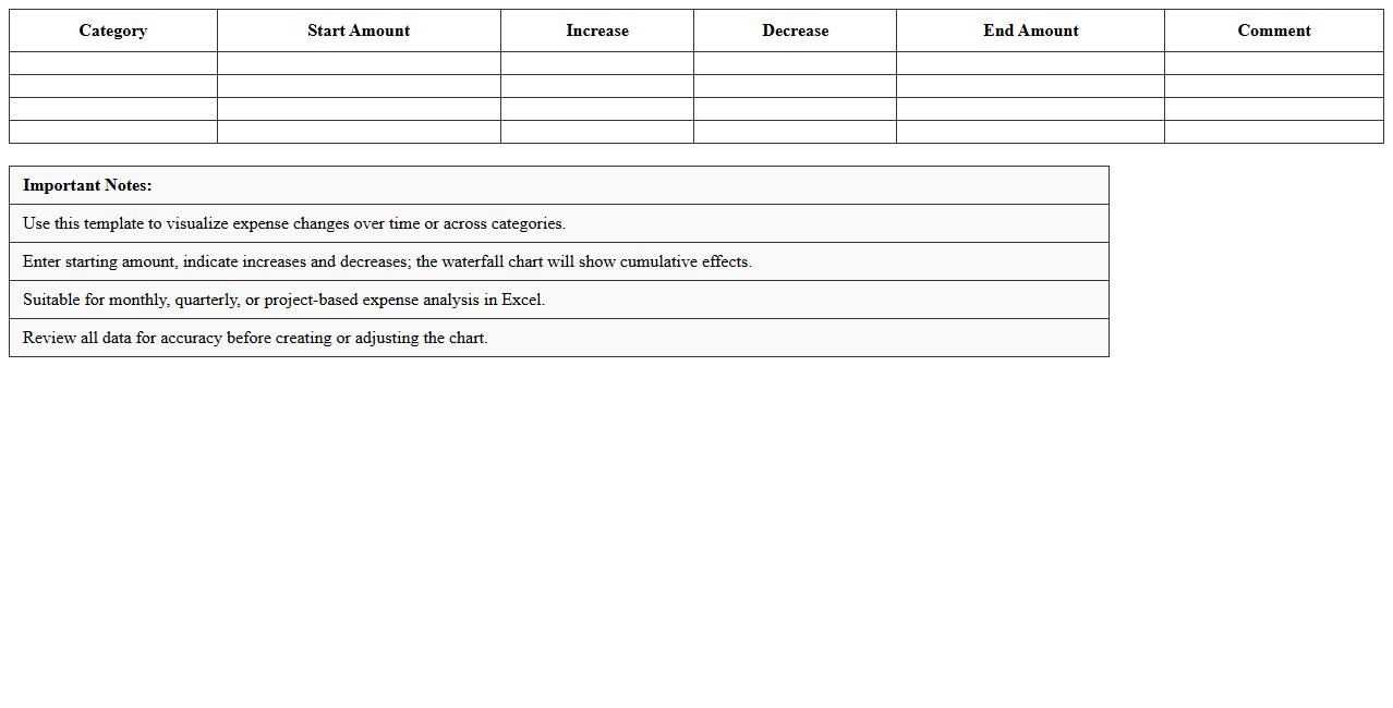
Waterfall Chart Excel Template for Expense Analysis visually breaks down cumulative effects of sequential expenses, illustrating how individual cost components impact the overall budget. This tool helps identify key drivers of expense changes, making it easier to track financial performance and spot areas for cost optimization. By providing clear, step-by-step expense visualization, it supports informed decision-making and strategic financial planning.
Waterfall Chart Excel Template for Profit and Loss
A
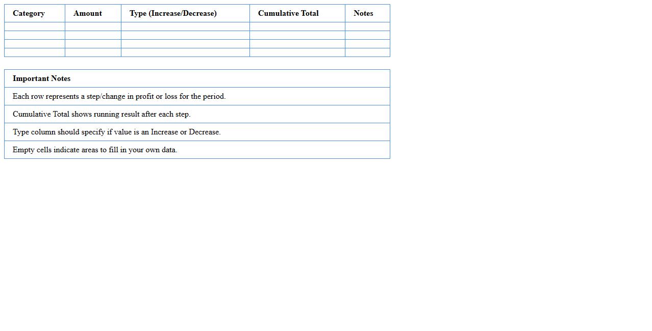
Waterfall Chart Excel Template for Profit and Loss documents visually breaks down the incremental changes in revenue, expenses, and net profit over a specific period, enhancing the understanding of financial performance. This template helps users identify key drivers affecting profit margins by clearly illustrating positive and negative impacts on overall profitability. It streamlines financial analysis, supports decision-making, and simplifies the presentation of complex profit and loss data in a clear, easy-to-interpret format.
Waterfall Chart Excel Template for Budget Variance
A
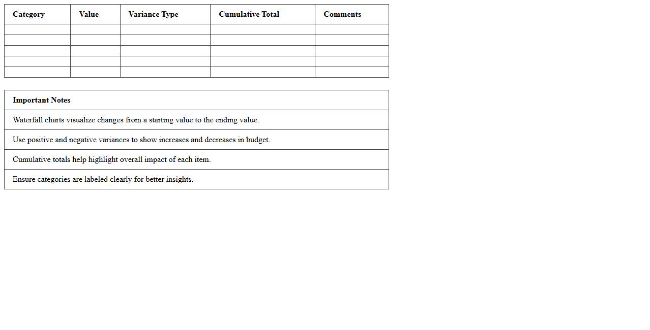
Waterfall Chart Excel Template for Budget Variance document visually breaks down the differences between planned and actual budget figures, highlighting increases and decreases across various expense categories. It simplifies complex financial data, making it easier to identify specific areas where spending deviates from the budget. This tool is useful for effective financial analysis, helping organizations quickly pinpoint cost overruns and savings for better budget management.
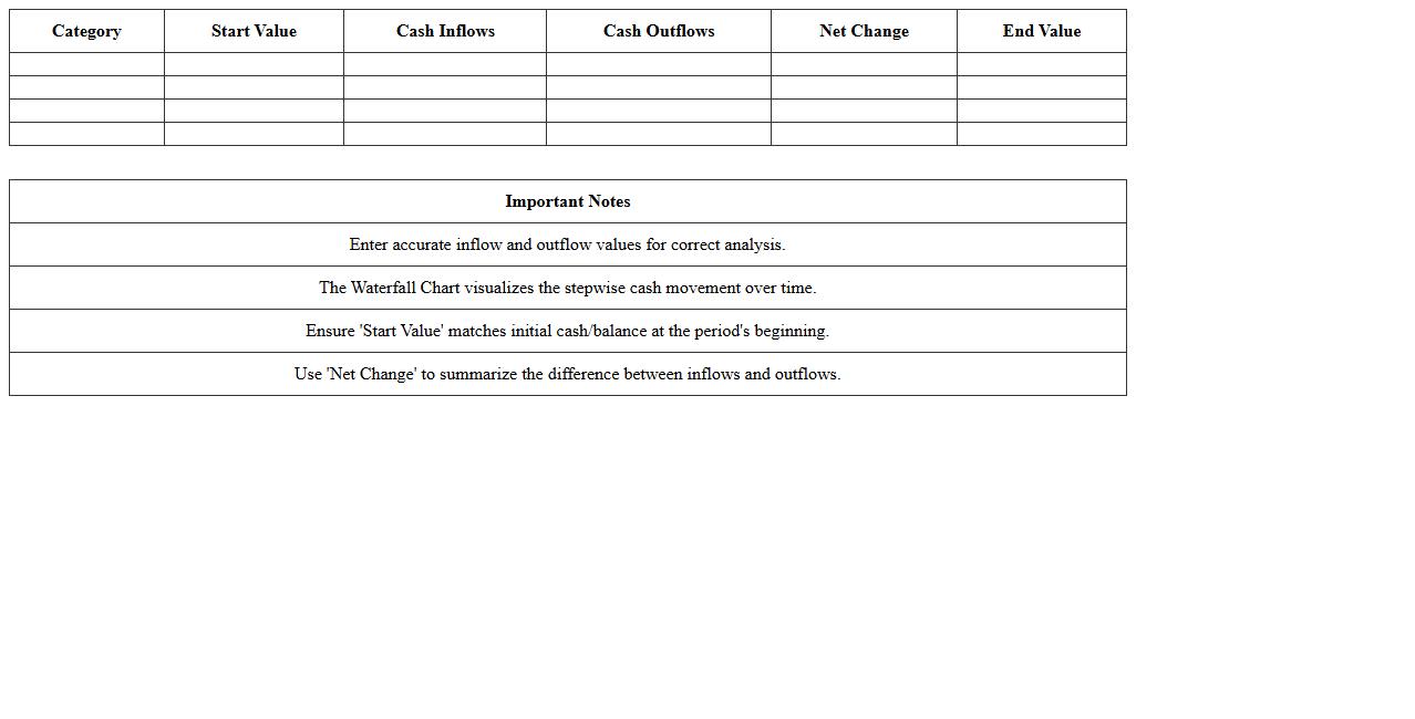
Waterfall Chart Excel Template for Cash Flow Analysis
A
Waterfall Chart Excel Template for Cash Flow Analysis visually breaks down the sequential changes in cash flow over a specific period, highlighting inflows and outflows clearly. This tool is essential for businesses to track financial performance, identify cash movement trends, and pinpoint areas affecting liquidity. Utilizing this template enhances decision-making by providing a transparent view of cash fluctuations, aiding in budget planning and financial forecasting.
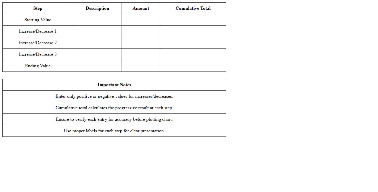
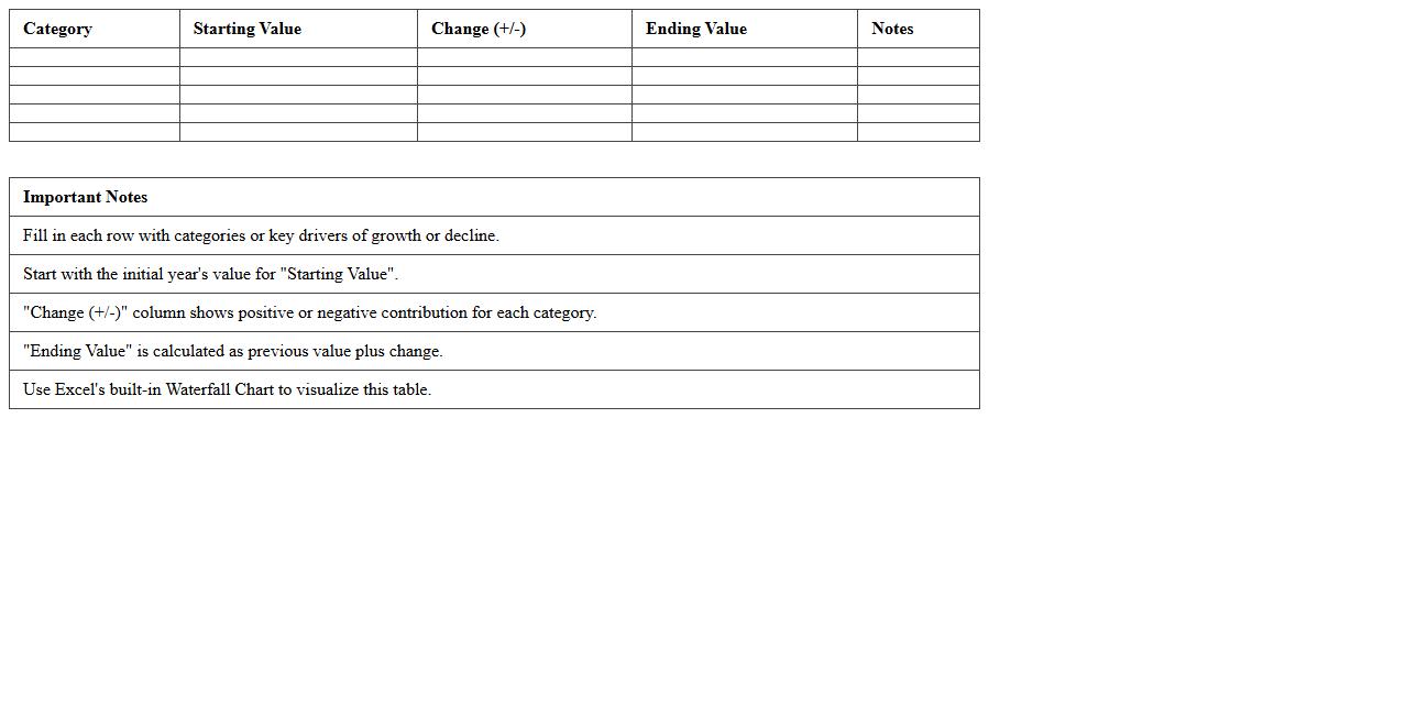
Waterfall Chart Excel Template for Project Financial Tracking
A
Waterfall Chart Excel Template for Project Financial Tracking visually breaks down the cumulative effect of sequential positive and negative values, helping track project expenses, revenues, and budget changes over time. This template allows project managers to easily identify variances, monitor cash flow dynamics, and make informed financial decisions by illustrating the step-by-step progress of financial metrics. Its clear and intuitive layout enhances transparency and accountability in project budgeting and cost management.
Waterfall Chart Excel Template for Sales Projection
A
Waterfall Chart Excel Template for Sales Projection is a visual tool that breaks down the incremental changes in sales figures over a specific period, highlighting positive and negative impacts clearly. This template helps businesses quickly identify trends, measure performance against targets, and forecast future sales with greater accuracy. Utilizing this chart streamlines decision-making by providing a transparent view of how each factor contributes to overall sales growth or decline.
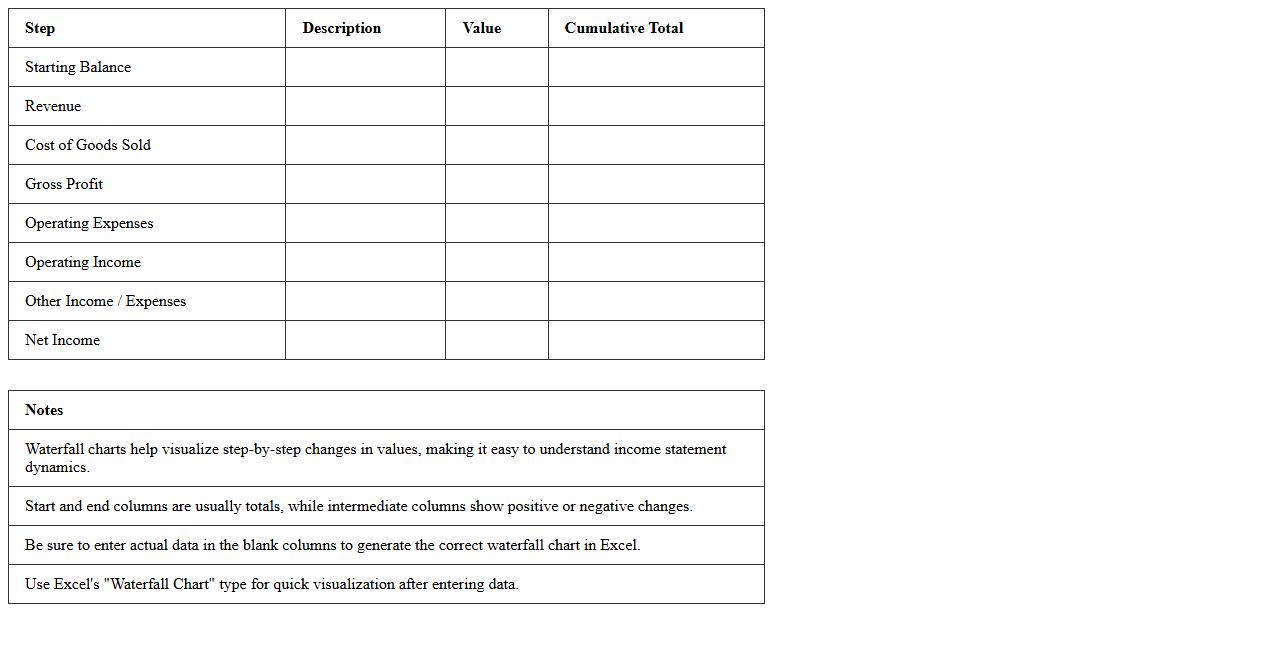
Waterfall Chart Excel Template for Income Statement
A
Waterfall Chart Excel Template for Income Statement visually breaks down financial data, showing how positive and negative values contribute to the final net income. This template helps users easily track revenue, expenses, and profit changes over a specific period, enhancing financial analysis and decision-making. It is especially useful for identifying cost drivers and understanding the cumulative effect of various income and expense components.
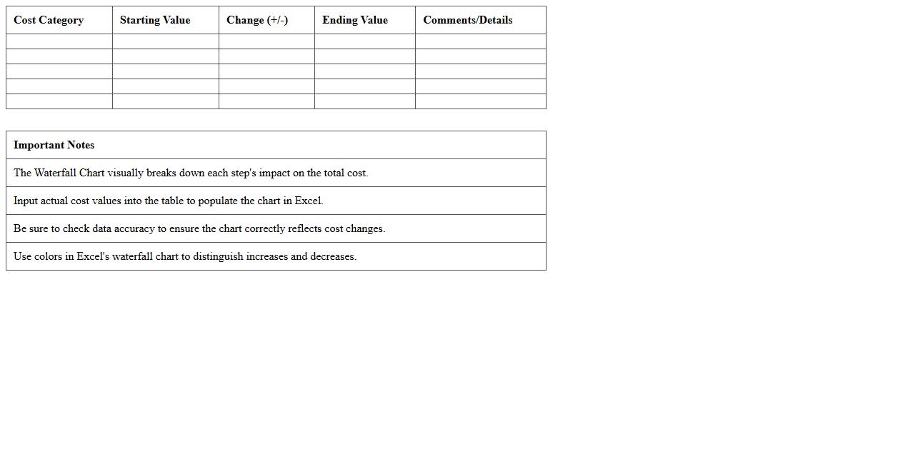
Waterfall Chart Excel Template for Cost Reduction Analysis
A
Waterfall Chart Excel Template for Cost Reduction Analysis visually represents the incremental changes in costs, highlighting how individual expenses contribute to overall budget adjustments. It simplifies the identification of cost-saving opportunities by clearly showing increases and decreases across different categories. This tool enhances decision-making by providing a clear, step-by-step breakdown of financial data, enabling more effective cost management strategies.
Waterfall Chart Excel Template for Year-over-Year Growth
A
Waterfall Chart Excel Template for Year-over-Year Growth is a visual tool designed to illustrate the cumulative effect of positive and negative values over consecutive periods, highlighting the net change in key metrics. It enables businesses to analyze financial performance, sales, or revenue trends by clearly showing incremental increases and decreases between years. This template aids decision-making by providing a straightforward way to track progress and identify contributing factors to growth or decline.
How to automate scenario analysis using Waterfall Chart in Excel for financial forecasting?
To automate scenario analysis with Waterfall Charts in Excel, create multiple data sets representing different financial scenarios. Use Excel's Data Validation or slicers to select scenarios dynamically, updating the chart automatically. Linking scenario inputs to the waterfall data ensures visualizations reflect the chosen financial forecast instantly.
Which data structure best supports multi-year financial trends in Excel Waterfall charts?
The best data structure for multi-year trends in Waterfall charts is a table format with columns for years, categories, and values. This structure supports easy addition or removal of years while maintaining consistency and chart accuracy. Utilizing Excel Tables also enables dynamic referencing and better integration with chart data sources.
How to incorporate conditional formatting for variances in Waterfall Chart Excel forecasts?
Incorporate conditional formatting by applying color-coded rules directly on the data cells that feed the Waterfall Chart. Highlight positive and negative variances with distinct colors like green for gains and red for losses for quick visual analysis. This method enhances the financial forecast's clarity and makes key changes stand out effectively.
Can custom categories be dynamically grouped in a Waterfall Chart for financial breakdowns?
Yes, custom categories can be dynamically grouped in Waterfall Charts by using a helper column that assigns group names based on category criteria. Applying PivotTables or dynamic array functions enables flexible grouping and aggregation of financial breakdowns. This approach enhances chart readability and allows for more meaningful visualization of grouped data.
What are best practices for linking Waterfall Chart steps to dynamic financial model inputs?
Best practices include using cell references and named ranges from the financial model for each Waterfall step to ensure the chart updates automatically. Maintain a well-organized source table that mirrors the financial model inputs and applies logical formulas for consistency. Additionally, use Excel's Table and structured referencing features to minimize errors and improve maintainability.
More Chart Excel Templates