The Waterfall Chart Excel Template for Financial Analysis provides a clear visualization of sequential financial data, highlighting increases and decreases in values over time. This template simplifies complex financial statements, enabling accurate tracking of profits, expenses, and net changes in a visually intuitive format. It serves as an essential tool for businesses aiming to present financial performance insights effectively.
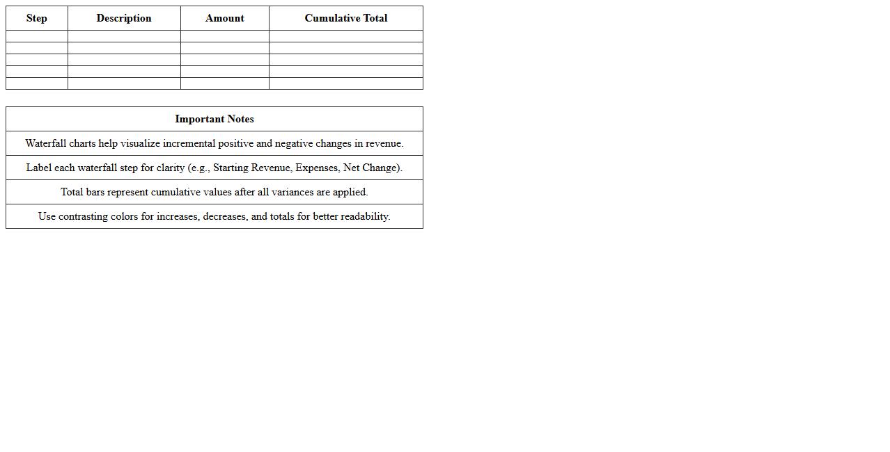
Waterfall Chart Excel Template for Revenue Analysis
A
Waterfall Chart Excel Template for Revenue Analysis visually represents incremental changes in revenue across different periods or categories, helping identify key drivers of financial performance. This template enables clear tracking of positive and negative fluctuations, making it easier to analyze contributions of various factors to overall revenue growth or decline. Using this tool enhances decision-making by providing a transparent, step-by-step view of revenue changes critical for strategic business planning.
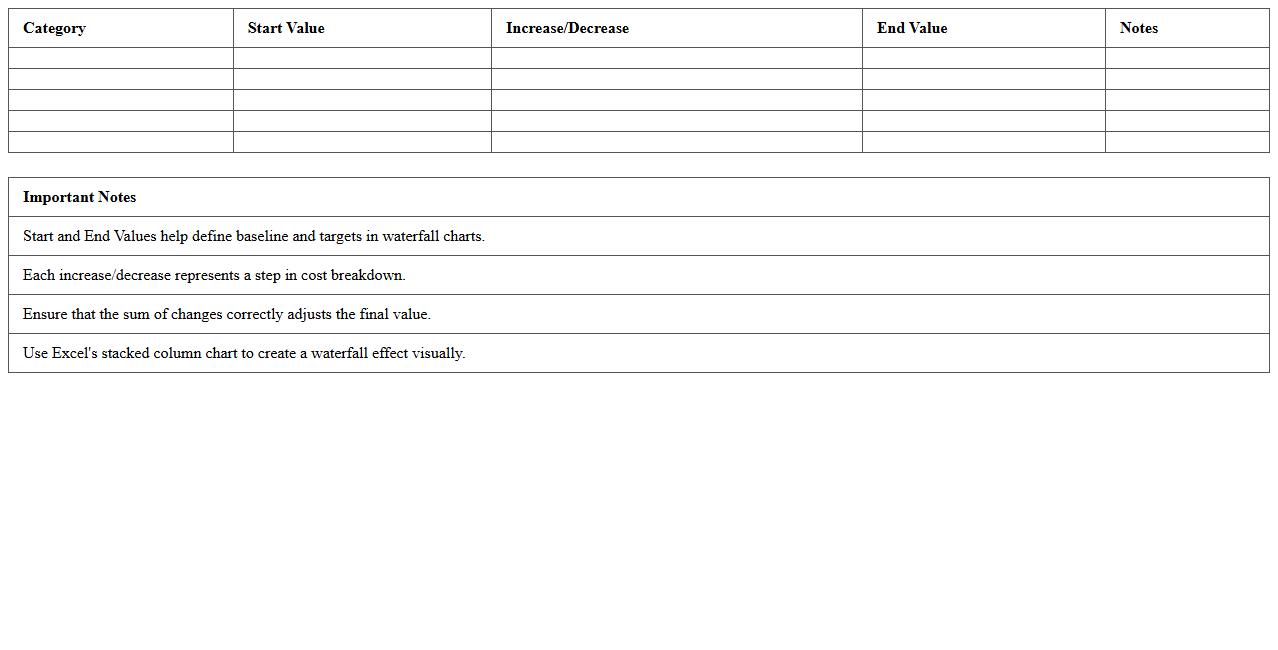
Waterfall Chart Excel Template for Cost Breakdown
A
Waterfall Chart Excel Template for Cost Breakdown visually represents the sequential impact of individual cost components on the total expenditure, making it easier to analyze each expense category's contribution. This template helps businesses identify cost drivers, track budget variations, and highlight areas for potential savings through clear, step-by-step monetary changes. Using this tool enhances financial transparency and supports informed decision-making in budget management and expense optimization.
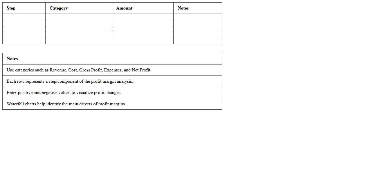
Waterfall Chart Excel Template for Profit Margin Analysis
A
Waterfall Chart Excel Template for Profit Margin Analysis is a visual tool that breaks down the cumulative effect of sequentially introduced positive or negative values, helping businesses track how various factors impact overall profit margins. It allows users to identify key contributors to profit increases or decreases, making financial data easier to interpret and communicate to stakeholders. This template enhances decision-making by clearly illustrating the step-by-step financial performance, enabling targeted strategies for improving profitability.
Waterfall Chart Excel Template for Expense Tracking
A
Waterfall Chart Excel Template for Expense Tracking is a visual tool designed to illustrate financial data flow by highlighting individual expense components and their impact on the total budget. It helps users easily identify how each expense contributes to the overall financial standing, making it simpler to analyze spending patterns and control costs. This template enhances budget management efficiency by providing clear, step-by-step insight into expense variations over time.
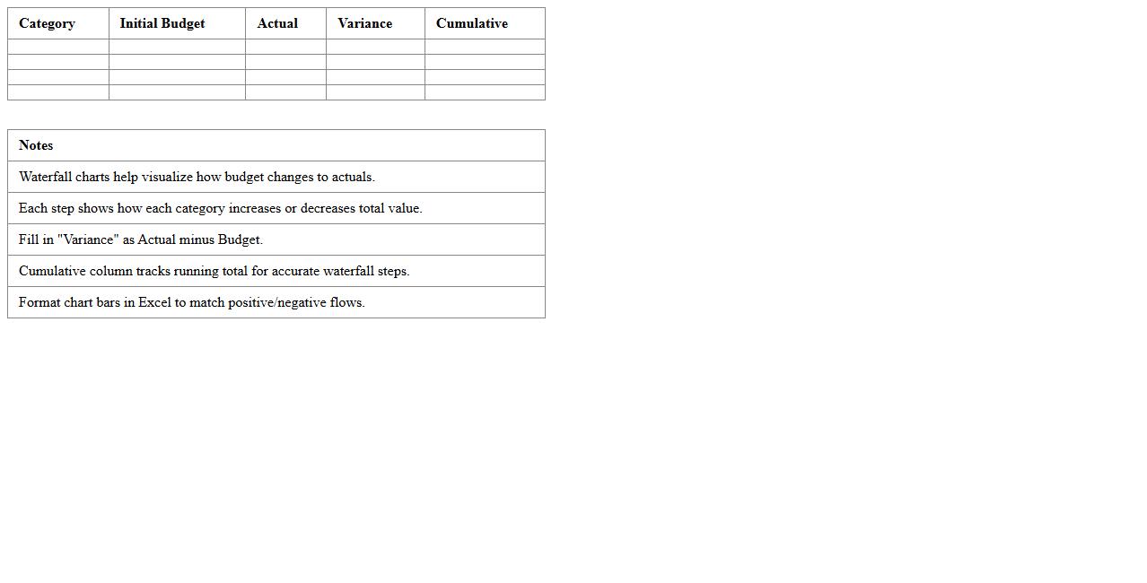
Waterfall Chart Excel Template for Budget to Actual Comparison
A
Waterfall Chart Excel Template for Budget to Actual Comparison is a visual tool that breaks down the incremental changes between budgeted and actual financial figures, clearly illustrating variances over time. It helps identify specific areas where spending deviated from the plan, enabling more precise financial analysis and informed decision-making. This template streamlines budget performance tracking, enhances transparency, and supports effective resource allocation in financial management.
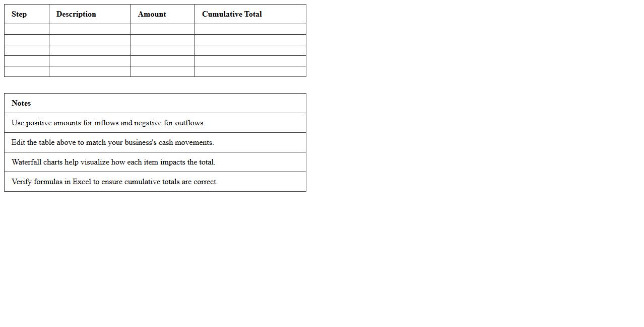
Waterfall Chart Excel Template for Cash Flow Analysis
A
Waterfall Chart Excel Template for Cash Flow Analysis visually breaks down the incremental changes in cash flow within a specific period, highlighting inflows and outflows in a clear, sequential manner. This tool is essential for accurately tracking financial performance, identifying key drivers of cash changes, and facilitating better budgeting and forecasting decisions. Its structured format in Excel allows for easy customization and real-time updates, improving financial transparency and strategic planning.
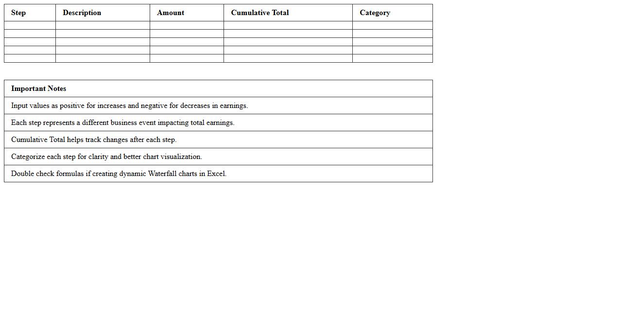
Waterfall Chart Excel Template for Earnings Breakdown
A
Waterfall Chart Excel Template for Earnings Breakdown visually represents the sequential impact of positive and negative values on total earnings, making complex financial data easier to understand. This template helps identify key profit drivers and expense categories by breaking down income and costs in a clear, step-by-step graphical format. Using this tool streamlines financial analysis, supports better decision-making, and enhances reporting accuracy for businesses and analysts.
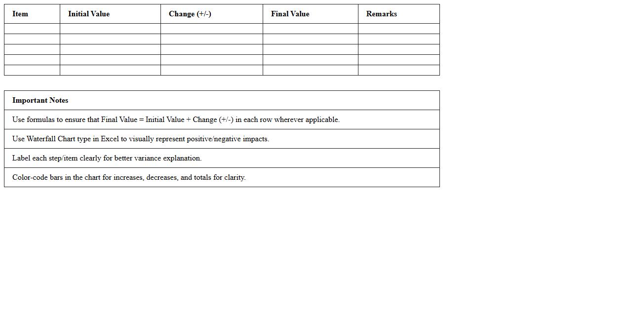
Waterfall Chart Excel Template for Variance Analysis
A
Waterfall Chart Excel Template for Variance Analysis is a structured spreadsheet tool designed to visually break down and analyze the incremental changes between starting and ending values. It helps users identify and quantify positive and negative variances in financial data, operational metrics, or project outcomes, making complex data easier to interpret. By clearly illustrating how individual components contribute to overall changes, it supports better decision-making and effective performance tracking.
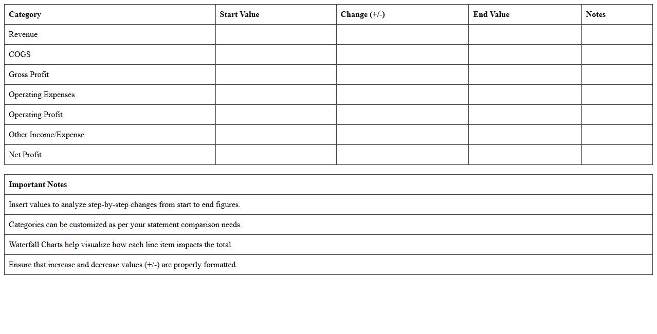
Waterfall Chart Excel Template for Financial Statement Comparison
The
Waterfall Chart Excel Template for Financial Statement Comparison is a visual tool that clearly illustrates the step-by-step changes in financial data, such as revenue, expenses, and net income, across different periods or entities. This template helps users easily identify the impact of individual financial components on overall performance, enabling more informed decision-making and trend analysis. By simplifying complex financial comparisons, it enhances clarity and efficiency in financial reporting and analysis.
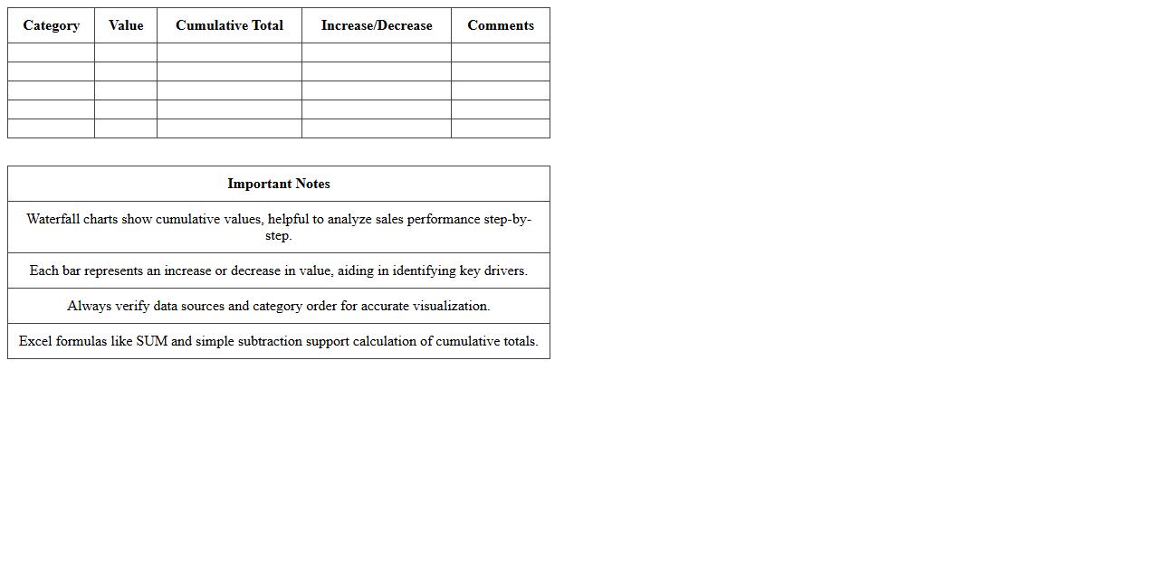
Waterfall Chart Excel Template for Sales Performance
A
Waterfall Chart Excel Template for Sales Performance is a pre-designed spreadsheet that visually breaks down the incremental changes in sales data over a specific period, highlighting gains, losses, and net results. This tool helps businesses track revenue fluctuations, identify key drivers of growth or decline, and make data-driven decisions to optimize sales strategies. By clearly illustrating the step-by-step impact of individual factors, it simplifies complex sales analysis and improves overall performance management.
How to automate monthly data updates in a Waterfall Chart for financial reports?
Automating monthly data updates in a Waterfall Chart requires linking the chart to a dynamic data source, such as an Excel table or named range. Using Excel features like Power Query or VBA macros can streamline the process by automatically importing and refreshing the data monthly. This ensures the financial reports are always current without manual intervention, improving accuracy and efficiency.
What are best practices for categorizing cash flow drivers in Excel Waterfall Charts?
Best practices for categorizing cash flow drivers in Excel Waterfall Charts include grouping similar items into logical categories such as operating, investing, and financing activities. Clear and consistent category labels enhance readability and help stakeholders quickly understand the cash flow movements. Additionally, maintaining a standardized format for categories across reports improves comparability over time.
How to visualize year-over-year variance using Excel Waterfall Charts for P&L statements?
To visualize year-over-year variance in Excel Waterfall Charts for P&L statements, include separate bars for prior year results, current year results, and variance amounts. Use color coding to differentiate positive and negative variances, making trends visually apparent. Incorporating dynamic labels and data labels helps highlight the magnitude of changes between years effectively.
Which Excel formulas enhance Waterfall Chart accuracy for capex analysis?
Excel formulas like SUMIFS, IFERROR, and dynamic array functions enhance Waterfall Chart accuracy for capex analysis by precisely aggregating expenditure data based on categories and time periods. Using these formulas allows automatic calculation of sub-totals, cumulative sums, and variance checks. This accuracy is critical for detailed Capital Expenditure reporting and decision-making.
How to highlight threshold breaches (e.g., budget overruns) in Financial Waterfall Charts?
To highlight threshold breaches such as budget overruns in Financial Waterfall Charts, apply conditional formatting or custom data point colors based on threshold criteria. Excel's built-in rules can dynamically change bar colors when values exceed budget limits, making overruns immediately visible. This visual alert system supports quicker identification and corrective action by financial teams.
More Chart Excel Templates