The Control Chart Excel Template for Quality Assurance provides an efficient way to monitor process performance and detect variations in production or service quality. It includes customizable control limits and real-time data plotting to help identify trends and ensure compliance with quality standards. This template simplifies data analysis, enabling teams to maintain consistent product quality and improve operational efficiency.
Control Chart for Process Monitoring Excel Template
A
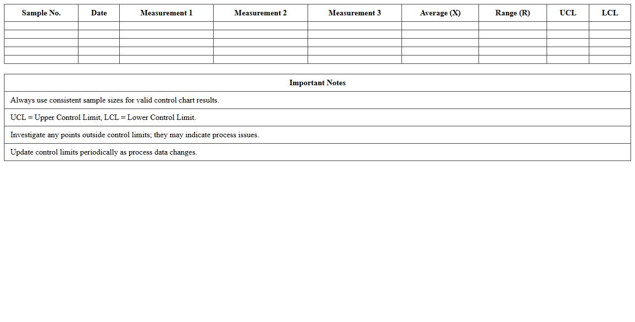
Control Chart for Process Monitoring Excel Template is a powerful tool designed to track and analyze process performance over time, helping identify variations and maintain consistent quality. It efficiently visualizes data with control limits, enabling early detection of trends, shifts, or outliers in manufacturing or service processes. This template simplifies continuous improvement efforts by providing actionable insights and supporting data-driven decision-making in quality management systems.
Quality Assurance X-bar Control Chart Excel Template
The
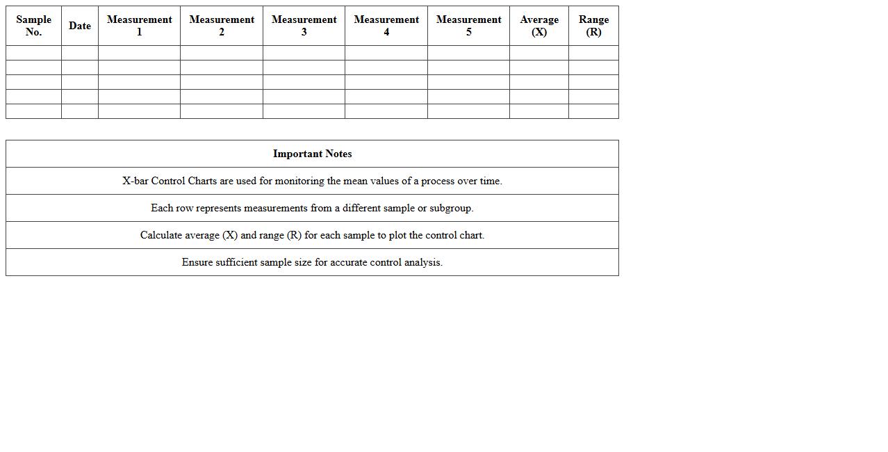
Quality Assurance X-bar Control Chart Excel Template is a specialized tool used to monitor process stability and control in manufacturing or service environments by tracking sample means over time. This template efficiently visualizes data to identify variations that signal potential quality issues, enabling timely corrective actions. Utilizing this document enhances decision-making and helps maintain consistent product quality, reducing defects and improving overall operational efficiency.
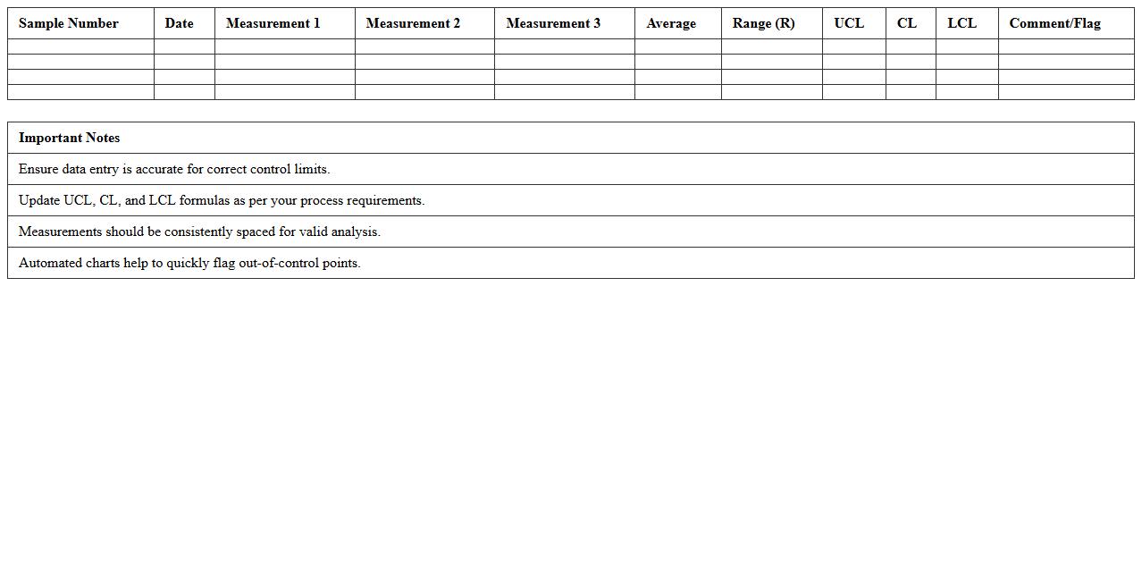
Attribute Control Chart Excel Template for Defect Tracking
The
Attribute Control Chart Excel Template for Defect Tracking is a practical tool designed to monitor and analyze the frequency of defects in a process over time. By visually representing data points against control limits, it helps identify variations that signal potential issues in quality control. This template is useful for maintaining consistent production standards, enabling timely corrective actions and improving overall process efficiency.
SPC Control Chart Excel Template for Manufacturing
The
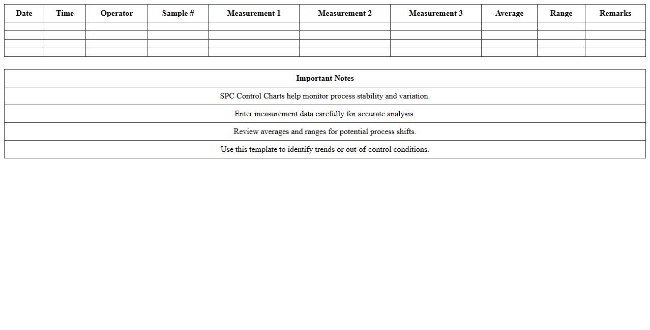
SPC Control Chart Excel Template for Manufacturing is a specialized tool designed to monitor and analyze process variations in production by visualizing data trends and identifying deviations from control limits. This template helps manufacturers maintain consistent product quality, reduce defects, and optimize process efficiency by providing real-time insights into process stability. Using this document enables proactive decision-making, supports compliance with quality standards like ISO, and drives continuous improvement initiatives in manufacturing operations.
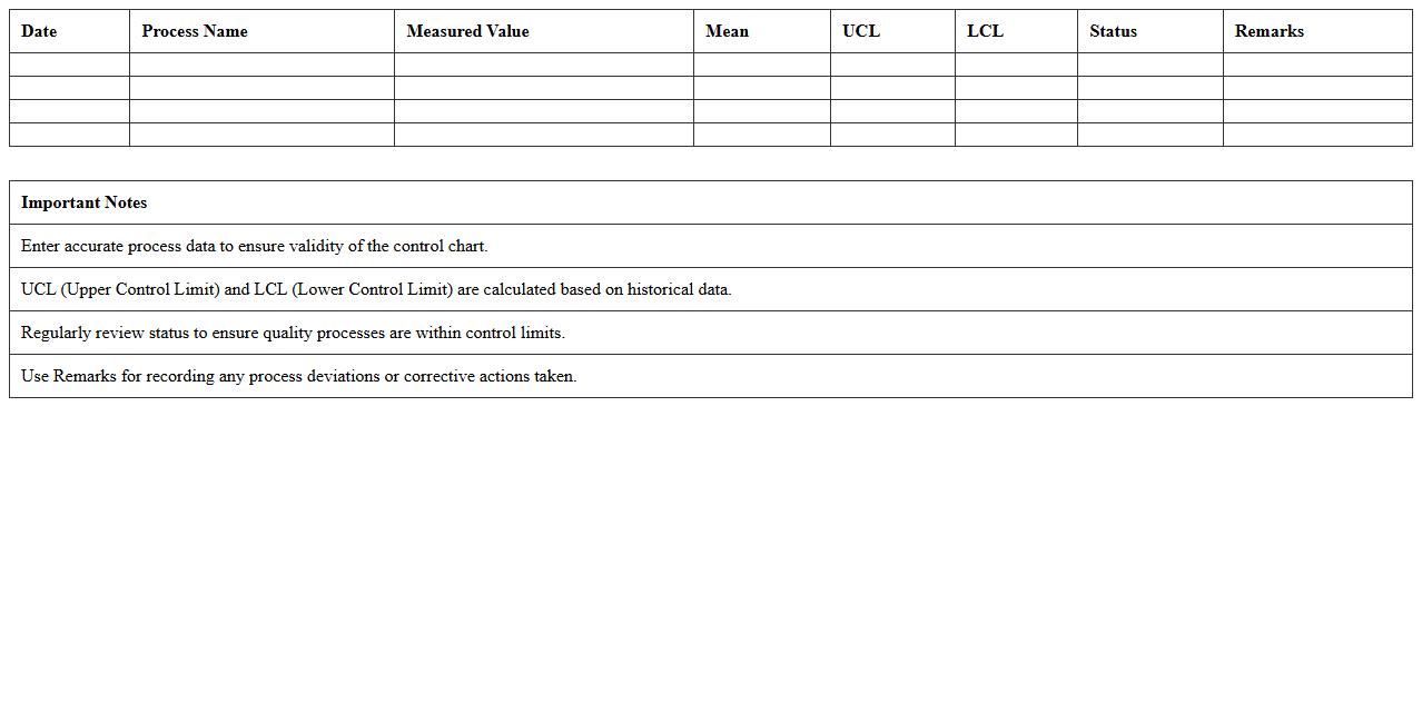
Quality Control Run Chart Excel Template
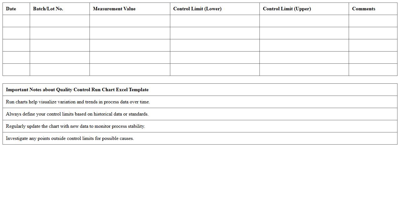
Quality Control Run Chart Excel Template is a structured spreadsheet tool designed to track and analyze process performance over time by plotting data points sequentially. It helps identify trends, shifts, or cycles in quality metrics, enabling timely interventions and continuous process improvement. Using this template enhances decision-making by providing clear visual insights into variations within production or service operations.
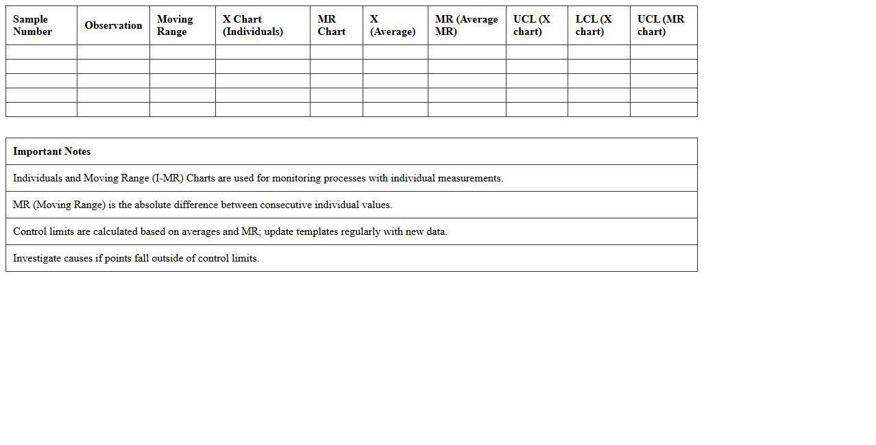
Individuals and Moving Range (I-MR) Control Chart Excel Template
The
Individuals and Moving Range (I-MR) Control Chart Excel Template is a powerful tool designed to monitor process variability and detect shifts in individual data points over time. It simplifies the analysis by automatically calculating control limits and plotting data trends, which helps identify irregularities and maintain process stability. This template is essential for quality control, enabling data-driven decisions and continuous improvement in manufacturing, service, and operational processes.
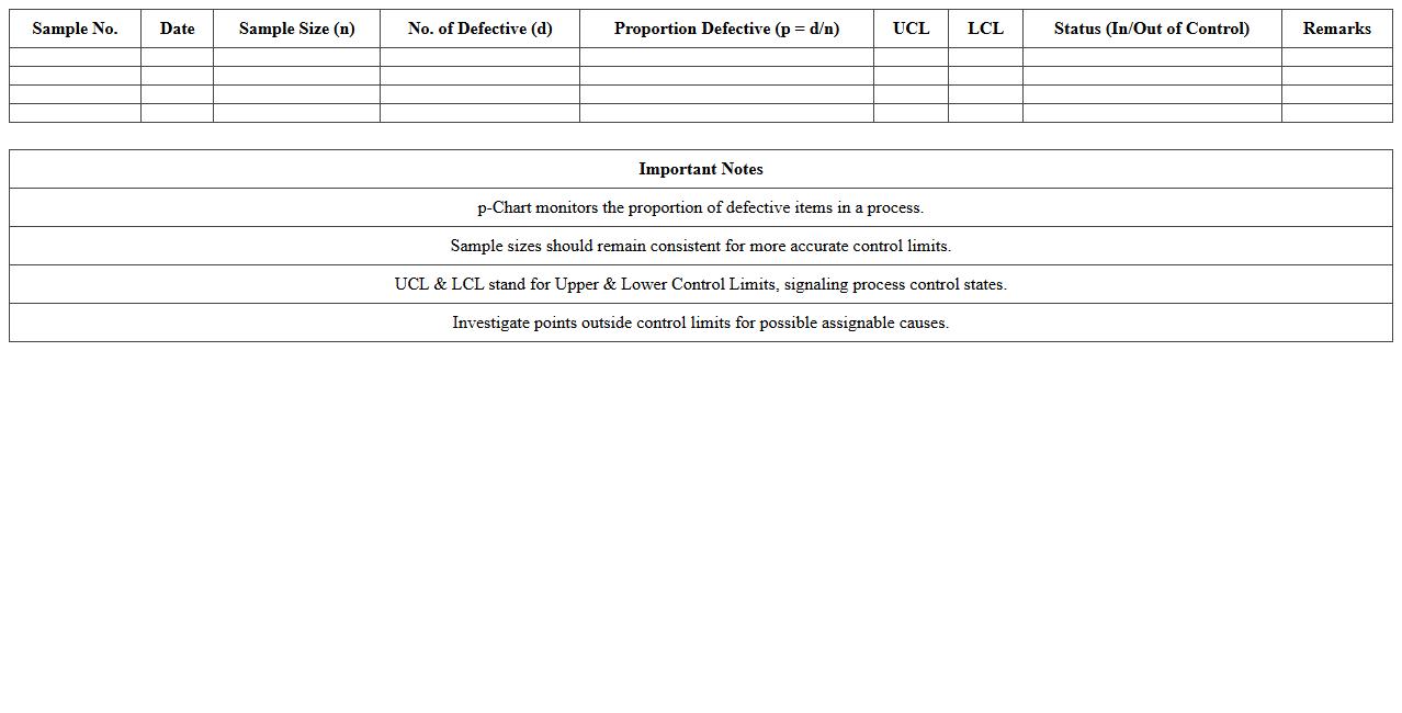
P-Chart for Proportion Defects Excel Template
The
p-Chart for Proportion Defects Excel Template document is a statistical tool designed to monitor the proportion of defective items in a process over time. It helps businesses track quality performance by visually identifying variations that indicate potential issues in production or service delivery. Using this template enables timely corrective actions, reducing defects and improving overall process control efficiency.
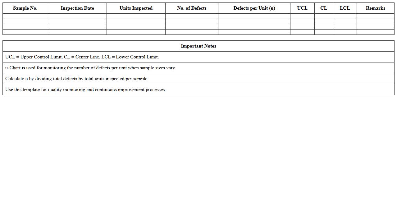
U-Chart for Defects per Unit Excel Template
The
U-Chart for Defects per Unit Excel Template is a statistical tool designed to monitor and analyze the number of defects per unit in a manufacturing or service process. This template helps in tracking variations in defect rates over time, enabling quality control teams to identify trends and implement corrective measures effectively. Using this chart supports continuous improvement initiatives and ensures that production standards meet customer expectations consistently.
Control Chart Dashboard Excel Template for QA Reporting
The
Control Chart Dashboard Excel Template for QA Reporting document is a specialized tool designed to monitor and analyze process variations through visual control charts, enabling quality assurance teams to identify trends and outliers efficiently. It consolidates data into dynamic dashboards that provide real-time insights into process stability and performance metrics, facilitating proactive decision-making and improvement initiatives. By standardizing quality data visualization, this template enhances accuracy, saves time, and supports continuous quality improvement efforts across projects.
Automated Shewhart Control Chart Excel Template
The
Automated Shewhart Control Chart Excel Template is a powerful tool designed to monitor and control process variability using statistical quality control methods. By automatically plotting control charts, it helps identify trends, shifts, or any anomalies in data, enabling timely decision-making for process improvement. This template enhances efficiency in quality management by simplifying data analysis and reducing manual errors in control chart creation.
How to automate control limit calculations in Excel for document letter quality checks?
To automate control limit calculations in Excel, start by calculating the average and standard deviation of the data sets using =AVERAGE() and =STDEV.S(). Use these results to set control limits with formulas like =AVERAGE(data_range) + 3*STDEV.S(data_range) for the upper control limit. Integrating these calculations within a dynamic table allows automatic updates as new letter quality data is entered.
What Excel formulas best track letter formatting errors in control charts?
Excel formulas like =COUNTIF() are ideal for tracking letter formatting errors by counting instances that deviate from standards. Combining COUNTIF with conditional logic, such as =IF(), helps isolate errors within specific criteria. These formulas feed directly into control charts, enabling precise error trend monitoring and quick detection of formatting anomalies.
How can special cause variations in letter approval times be visualized using control charts in Excel?
Special cause variations in approval times are best visualized by plotting time data against calculated control limits on an Excel line or scatter chart. Apply upper and lower control limits derived from historical data to highlight points outside expected ranges. Annotating these charts with conditional formatting enhances visibility of unusual variations during the approval process.
Which Excel chart type most effectively displays document revision frequencies for QA audits?
The column chart is highly effective for displaying document revision frequencies as it visually compares counts across different versions. It offers clear, immediate insights into patterns or spikes in revisions during QA audits. Adding data labels and trendlines further refines the analysis of revision frequency trends.
How to set up conditional formatting in Excel to flag out-of-control document process steps?
Use Excel's conditional formatting rules to highlight cells that fall outside control limits by applying formulas such as =OR(cell_value > upper_limit, cell_value < lower_limit). Choose distinct colors like red to flag these out-of-control document process steps effectively. This visual cue speeds up the identification and correction of process deviations in real time.
More Chart Excel Templates